I’ve been test-driving Tilemill 2 (aka Mapbox Studio) off and on over the last couple of weeks and it’s been a lot of fun. The new Mapnik Vector Tiles support in TM2 is truly game-changing, allowing you to apply custom cartography to Mapbox basemaps and quickly mix and match them with your own data layers in ways just not possible with other commercial basemaps.
For my test run I decided to use Tilemill 2 to improve on a landslide web map published by the state of Oregon using ArcGIS Server. Here’s their existing map:
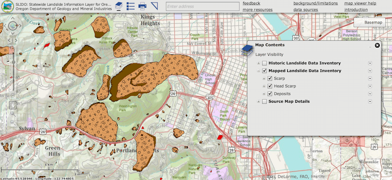
I identified a number of cartographic improvements I could make. Specifically:
- Draw Order. Both the scarp and deposit boundaries for each landslide are drawn on top of everything including structures, roads, and labels. You simply can’t see what’s underneath. Wouldn’t it be interesting for the landslides to be drawn underneath so you can clearly see what buildings lie on top of these historical landslides?
- Slide Angle. I noticed there are some interesting attributes in the landslide deposits layer. First a SLOPE attribute indicating the angle of the slope that slid. What if I set the color of each deposit polygon based on its SLOPE value allowing you to quickly visualize whether low angle or high angle landslides are occuring in a given area?
- Slide Direction. I also noticed a DIRECT field for each deposit polygon indicating which direction the land slid. What if I could dynamically draw arrows on each deposit polygon pointing in the direction of the slide, allowing you to quickly see which direction the slides traveled?
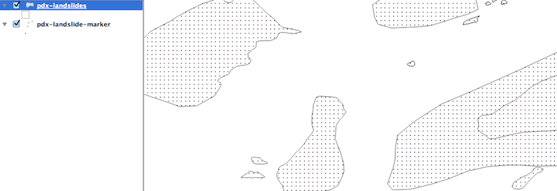
Getting Started With TM2
To get started I downloaded the latest Statewide Landslide Information Database for Oregon (SLIDO) and extracted the scarp and deposit layers using the ESRI Geodatabase plugin for QGIS discussed in a previous post. I then imported the shapefiles into Tilemill 2 as new datasources.
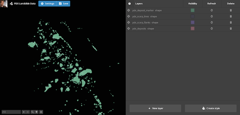
I then published the data layers to mapbox.com (as vector tiles instead of image tiles!).
Next I downloaded the OSM Bright project on GitHub which comes with decent cartography for the Mapbox Street layer out of the box. I started with this style and toned down the color palette a bit.
I then added both the Terrain and Landslide datasources to the project using their respective Map ID’s. The order of the datasources in this list is critical as the first map ID listed is rendered on the bottom. In my case I wanted the terrain layer to be on the bottom, followed by the landslide features, and then the streets layer.
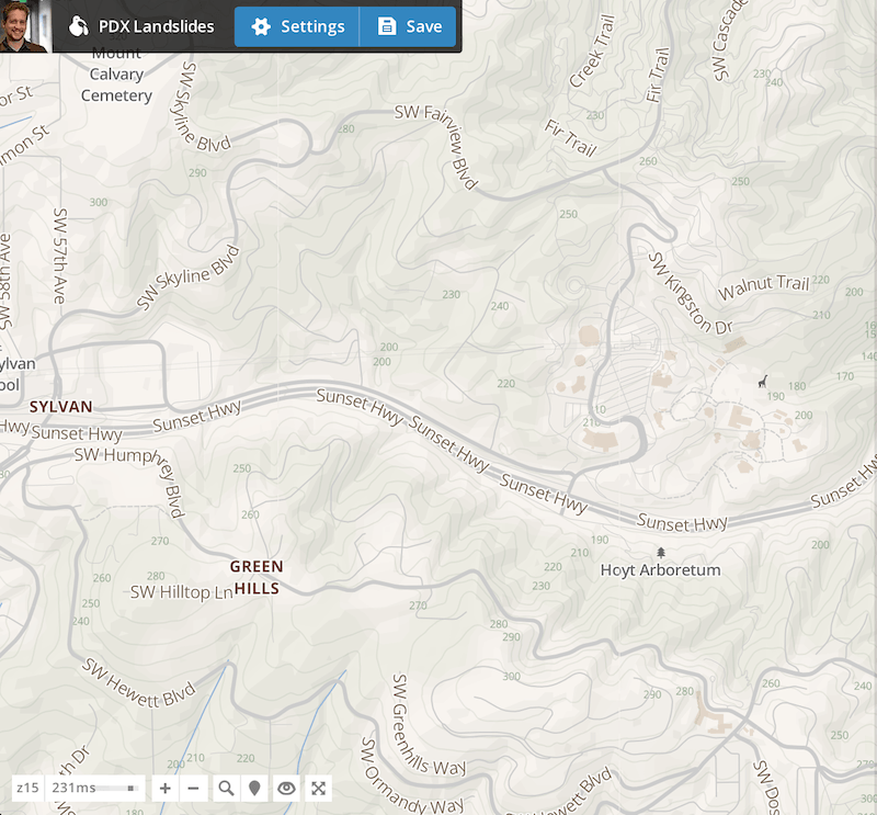
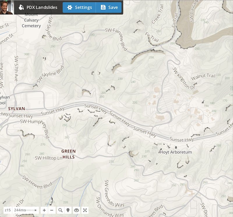
Terrain Layer
Next I styled the terrain layer adding landcover, a soft hillshade, and small altitude labels:
#landcover {
  polygon-opacity:  0.03;
  [class='wood'] { polygon-fill: darkseagreen; }
  [class='scrub'] { polygon-fill: mix(darkseagreen,cornsilk,75%); }
  [class='grass'] { polygon-fill: mix(darkseagreen,cornsilk,50%); }
  [class='crop'] { polygon-fill: mix(darkseagreen,cornsilk,25%); }
  [class='snow'] { polygon-fill: white; }
}

#contour [zoom>=15]{
  line-width: 1;
  line-color:  #8da68d;
  line-opacity:  0.15;
}

#contour [zoom>=15]{
  text-name: [ele];
  text-face-name: 'Open Sans Regular';
  text-avoid-edges: true;
  text-fill: #8da68d;
  text-size: 8;
}

#hillshade [zoom<=17]{
  polygon-opacity: 0.03;
  [class='full_shadow'], [class='medium_shadow'] {
    polygon-fill: black;
  }
  [class='full_highlight'], [class='medium_highlight'] {
    polygon-fill: white;
  }
}
Landslide Scarps
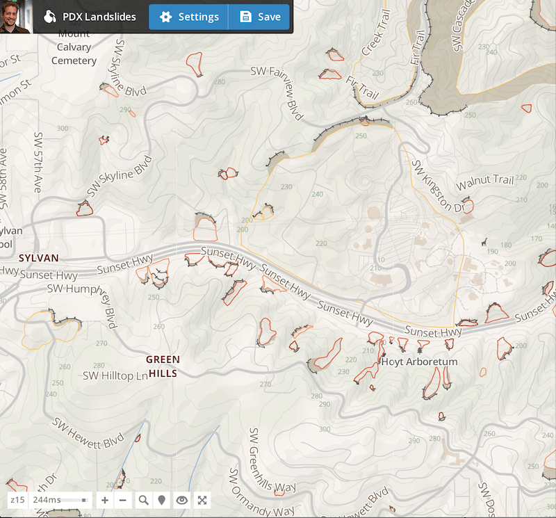
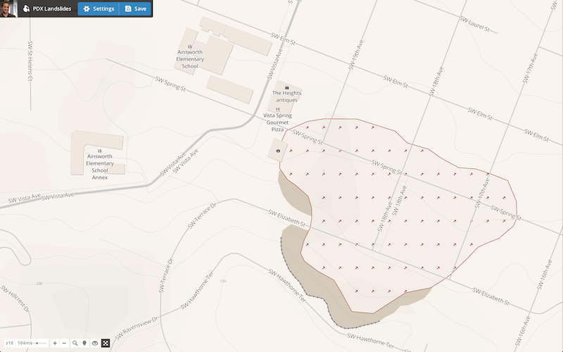
Then it was time to add the landslide scarps. A scarp is the steep exposed area at the source of a slide that often cleanly breaks from the soil or rock above. I styled the scarp lines with a dark dashed line to match the DOGAMI map and then styled the scarp flank below the line with a light transparent tan color.
#pdx_scarp_lines {
  ::line, ::hatch { line-color: #555; }
  ::line { line-width:1; }
  ::hatch {
    line-width: 4;
    line-dasharray: 1, 8;
    line-dash-offset: 4;
  }
}

#pdx_scarp_flanks {
  polygon-fill:  #a39071;
  polygon-opacity: 0.4;
}
Landslide Deposits
Next I added the landslide deposit boundaries which are the areas of soil and rock that actually moved and form the debris field of the slide. For these I applied a color ramp based on the angle of the slope. Yellow is a slope less than 10 degrees, orange 10-15, light red 15-25, and dark red greater than 25. You might be surprised to see that many of the historical landslides are not on extremely steep slopes.
#pdx_deposits {
  line-width: 1;
  [SLOPE<=90] {
    polygon-fill: #a4291f;
    line-color: #a4291f;
  }
  [SLOPE<=25] {
    polygon-fill: #d35944;
    line-color: #d35944;
  }
  [SLOPE<=15] {
    polygon-fill: #ee9168;
    line-color: #ee9168;
  }
  [SLOPE<=10] {
    polygon-fill: #f7ca75;
    line-color: #f7ca75;
  }
  [zoom<=14] {polygon-opacity: 0.5}
  [zoom>14] {polygon-opacity: 0.02}
}
Finally I added in the directional arrows for the deposit polygons based on the direction of the slide.
To do this I first used QGIS to create a layer of regularly spaced points by going to Vector->Research Tools->Regular Points. Play around with this to find a point density that suits your needs. Note that this creates a lot of points! I was only working with landslide data for the Portland area so it wasn’t a big issue.
Then I clipped this point layer against the deposits layer creating evenly spaced points within the deposit polygons.
The final step was to transfer the DIRECT and SLOPE attribute values from each polygon feature to the new point features within it so that I could draw a colored arrow at each point and rotate it to the proper direction. I honestly didn’t expect this transfer would be easy but the SAGA toolbox in QGIS had exactly what I needed. Just go to Processing->Shapes-Points->Add polygon attributes to points. Voila.
I then added this deposit marker layer to the map along with the CartoCSS needed to color and rotate the arrow properly based on the DIRECT attribute.
#pdx_deposit_marker [zoom>=15]{
[SLOPE<=90] {marker-fill: #a4291f;}
[SLOPE<=25] {marker-fill: #d35944;}
[SLOPE<=15] {marker-fill: #ee9168;}
[SLOPE<=10] {marker-fill: #f7ca75;}
marker-type: arrow;
marker-line-color: transparent;
marker-fill-opacity: 1.0;
marker-height: 7;
marker-width: 7;
/* Caution the DIRECT attribute is not based on a 0 degree north! */
marker-transform: rotate([DIRECT]-90,0,0);
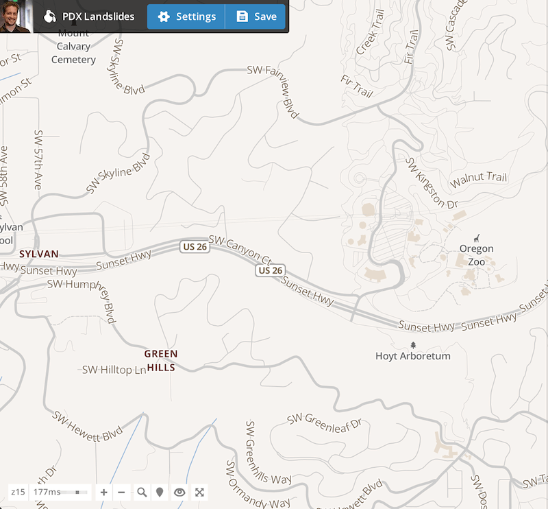
}Not a bad start. With the arrows I can really start to see how the soil moved on the landscape in relation to the topography. You can almost feel the size of the larger landslides with all of the tightly packed arrows. Here’s what it looks like when I zoom into an area showing schools and other public buildings.
Interesting, a fire station crosses right over the edge of an ancient landslide boundary. The nearby schools on the other hand are not. Let’s take a look up in the West Hills at the Zoo.
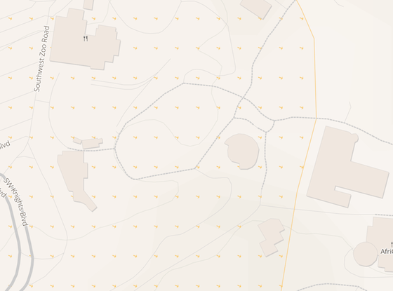
Wow, a lot of the buildings at the Zoo are sitting on old relatively low-angle landslide deposits. Is this a concern? Maybe not. I don’t know I’m not a geologist :) Some of these slides are said to be millions of years old and certainly there’s other causes of soil instability like rivers and earthquakes.
Concern aside, I’m really looking forward to the formal release of Tilemill 2 sometime this year to be able to push some of these map visualizatons further. In the meantime you can find these Tilemill 2 project files on my GitHub and you are welcome to work with them:
https://github.com/twelch/osm-bright.tm2/tree/pdx-landslide
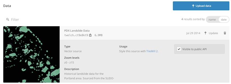
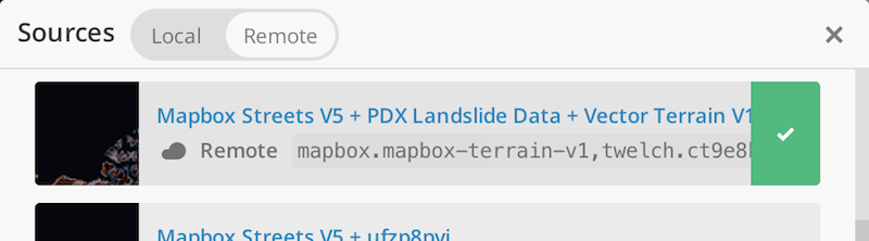
In addition, the landslide data I published on mapbox.com is publicly available for use with the Map ID twelch.ct9e8kt9. This data is not published as image tiles as far as I know, only as vector tiles for use in Tilemill 2.
Enjoy.